
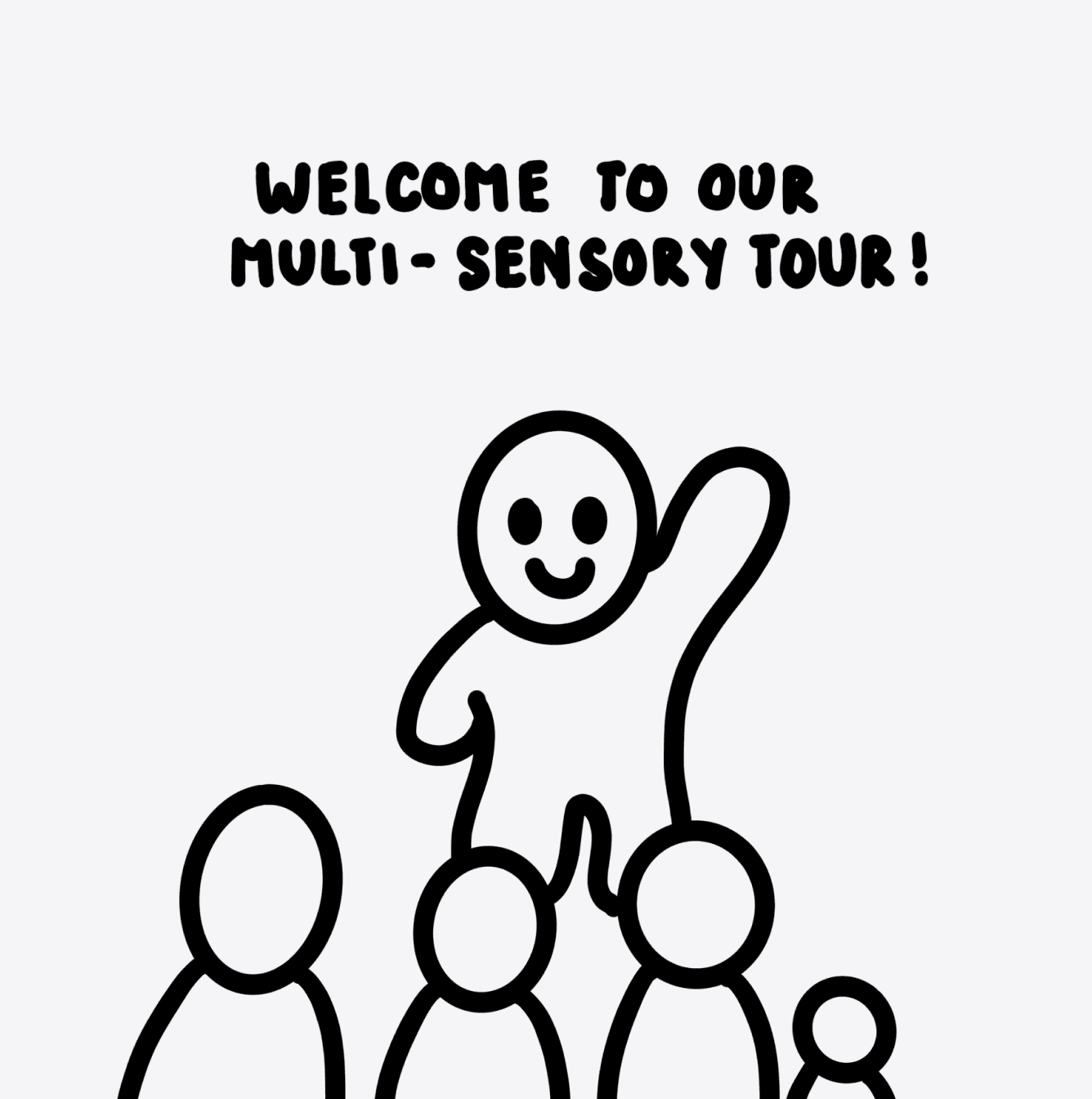
Buddy
Revolutionise Accessibility through Innovative
Design Solutions
OVERVIEW
A Project Overview
Challenge
Individuals with visual impairments face significant challenges in navigating and accessing museum exhibits, limiting their ability to fully engage with and experience these cultural spaces.
Opportunity
Revolutionise accessibility through multi-sensory experiences, inclusive technology, and innovative design solutions.
⏳
Timeline
Jan 2025 - April 2025
🫡
Disciplines
User Experience Design
User Interface Design
Interaction Design
⚖️
Responsibilities
UX Research
Sketching
Prototyping
✏️
Tools
Figma
Illustrator
AT A GLANCE
Where Inclusion Falls Short
A 2023 research study conducted by the Grand Rapids Public Museum (GRPM) and Grand Valley State University (GVSU) identified several barriers to accessibility for visually impaired visitors who faced difficulties in navigating and engaging with museum exhibits due to inaccessible signage, the lack of multi-sensory information, and inadequate staff training.
100%
participants reported that existing signage did not assist them in navigation
(Fortuna et al., 2023)
83%
of visually impaired visitors experienced challenges engaging with exhibits
(Fortuna et al., 2023)
68%
of museum staff had received no formal training in making exhibits accessible
(Eekhoffb et al, 2023)
research PROBLEM statement
To investigate the current experience of the visually impaired while navigating and engaging in museum spaces
research
Understood, Yet Overlooked
Literature Reviews
Focusing on accessibility, I conducted literature reviews relevant to my research objective to analyse the key barriers faced by visually impaired individuals at museums.
Inaccessible Navigation
& Layout
social barriers
lack of touchables
small elevator
Limited
Pre-Visit info
small print
no
Audio
dim
lighting
visual clutter

Findings from these studies highlighted key challenges visually impaired visitors often face, including inaccessible signage, limited multi-sensory information, difficulties with pre-visit planning, and environmental barriers.
Online Ethnography
Furthermore, I sought insights from visually impaired and legally blind visitors by examining and evaluating firsthand experiences and current accessibility features available at museums, which were shared through articles, documentaries, and online forums.
‘I can’t read the signs that say what can be touched and what can’t be touched. I need to have access to what is available to read.’
‘I think audible signage is more useful than braille signage. A lot of visually impaired people do not read braille.’
‘Some of the lights were too dim and I could not see very well. If it does not hinder the exhibit, they should turn the lights up.’
‘I got bored really quick from just walking through and not being able to interact.’
‘An audio guide is what would help me. They are easy to use and can make your visit a lot more comfortable.’
‘All areas in the museum where everything was behind glass. There was nothing for me.’
These sources emphasise the importance of providing multi-sensory experiences to enhance contextual information and facilitate accurate mental images (something most museums unfortunately haven’t quite figured out yet).
RESEARCH
Gather Insights from the People
Surveys
For the quantitative research, I conducted user surveys with 55 participants to systematically gather insights from diverse categories of visually impaired visitors. The survey consisted of close-ended questions through Likert scales and rating systems (1-5), with two open-ended questions for potential users to share insightful experiences or concerns if the previous inquiries did not allow them to do so.
30
25
20
15
10
05
00
1
2
3
4
5

Museum websites or apps effectively assist with pre-visit accessibility planning
30
25
20
15
10
05
00
1
2
3
4
5

Museums effectively integrate tactile, auditory, and other sensory interactions
30
25
20
15
10
05
00
1
2
3
4
5

Rate your overall satisfaction with the accessibility of museums you've visited
Survey results indicate moderate dissatisfaction with museum accessibility, particularly highlighting insufficient pre-visit planning support, inadequate multi-sensory integration, and overall neutral to negative visitor experiences -> clearly demonstrating significant opportunities for improvement.
Semi-Structured Interview
To further understand the needs and challenges of our target users, I conducted 30-minute semi-structured interviews over a Zoom call with 12 participants representing different levels of visual impairment—low vision, legally blind, and totally blind—who frequently visit museums and cultural institutions.
🥸
What’s one thing museums could implement to improve accessibility?

🤓

🤔

Participants from all categories of visual impairment emphasised the need for improved signage and assistive technologies, such as audio guides, to overcome barriers caused by inadequate audio descriptions and inaccessible signage.
RESEARCH
Follow the User Journey
With the insights gathered, I crafted a persona that encapsulates the specific needs, goals, and pain points of a visually impaired visitor.

🤌🏼
❤️
🎯
Next is the user journey, which focuses on Craig’s current experience as a visually impaired museum enthusiast navigating exhibits in the museum, highlighting the challenges he encounters. It examines barriers such as insufficient audio descriptions, inaccessible museum layouts, limited pre-visit resources, and ineffective multi-sensory experiences alongside his emotional responses and coping strategies.
EXCITEMENT
Planning
Craig plans a museum visit to explore a historical exhibition he's excited about.
Navigating Challenges
Arrival
He arrives at the museum but struggles with orientation and navigation.
Frustration
Engagement
He tries to engage with the exhibits but encounters insufficient multi-sensory resources.
DISAPPOINTMENT
Reflection
Craig reflects on his visit, feeling the experience fell short of his expectations.
Thoughts
‘I can't wait to experience the latest historical exhibit. I hope they have good accessibility features!’
Actions
Checks museum websites and apps for audio descriptions, accessibility maps, and detailed exhibit information.
Thoughts
‘Finding my way around is harder than expected. The signage isn't helpful.’
Actions
Tries using museum-provided tactile maps and signage but finds them limited.
Thoughts
‘I feel I'm missing important context without detailed audio or tactile information.’
Actions
Relies heavily on incomplete audio guides and occasional assistance from museum staff.
Thoughts
Relies heavily on incomplete audio guides and occasional assistance from museum staff.
Actions
Provides feedback to museum staff and searches online forums for more accessible alternatives.
SYNTHESIS
Unveiling Insights
With these insights gathered from the various research methods, I identified several critical barriers to accessibility. These insights were organised into an affinity map based on the four components of accessibility - Spacial Orientation, Displacement, Communication & Use (Andrade & Bins Ely, 2012) to highlight common themes and key pain points.
🧭
Planning & Navigation
The lack of accessible signage, unclear maps, and inadequate orientation tools make it difficult for visually impaired visitors to navigate museum spaces independently and confidently.
💡
Physical Accessibility
Environmental barriers such as dim lighting, cluttered pathways, and the absence of tactile strips restrict movement and create safety concerns, significantly impacting the autonomy and comfort of visually impaired visitors.
👩🏻
Staff Training & Support
The lack of staff awareness and the absence of disability etiquette training lead to missed opportunities for proactive support, leaving visually impaired visitors feeling overlooked or hesitant to seek help.
📲
Assistive Technology
Limited access to reliable audio guides, tactile devices, and well-integrated assistive tools hampers engagement and prevents visually impaired visitors from experiencing exhibitions independently.
Reframed problem statement
Museums remain inaccessible to visually impaired visitors, limiting their navigation, interaction, and sense of inclusion, highlighting the need for better accessibility measures
IDEATION
How Might We Address This
Next, I formulated 15 How-Might-We statements and discussed the potential for idea generation for each one. I then picked the top 3 statements to focus on, prioritising the key issues highlighted in the Affinity Map.
#2
How might we design an accessible digital guide that provides real-time navigation and exhibit descriptions for visually impaired visitors?
#3
How might we create a multi-sensory experience that enhances engagement with exhibits through touch, sound, and smell?
#10
How might we design interactive audio guides that provide rich, descriptive narratives about exhibits tailored for visually impaired visitors?


IDEATION
Developing a Solution
Crazy’s 8 Sessions
Following the ideation phase, I organised the chosen ideas into cohesive themes to create a seamless and comprehensive enhancement to the visitor experience. I then conducted a Crazy 8’s brainstorming session, refining and developing each of my strongest concepts.
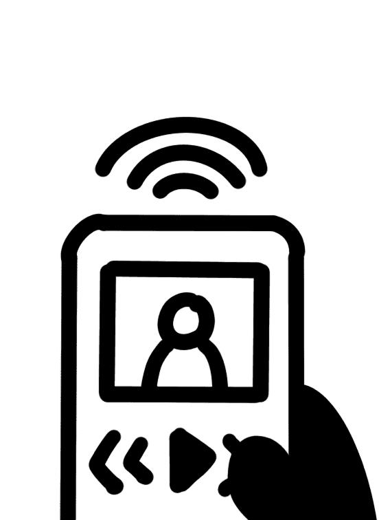
ACCESSIBLE MUSEUM UP - BUDDY
GUIDED MULTI-SENSORY TOUR
QR CODE SCANNING


1.
The user receives step-by-step audio guidance and haptic feedback to navigate through the space safely.
2.
The user listens to audio alerts to identify and avoid nearby obstacles throughout their journey.
3.
The user uses voice commands to search for exhibits or destinations.
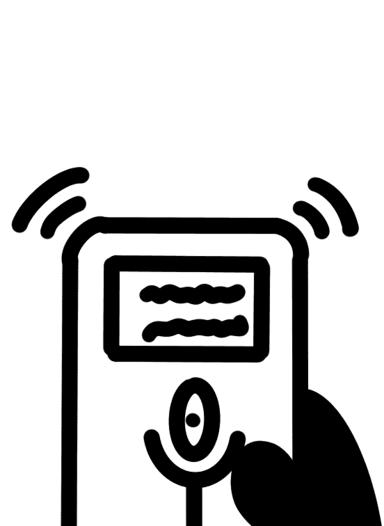
4.
The user arrives at the exhibit, where Braille labels are also available for tactile exploration.

5.
User selects their chosen audio descriptions on the app
6.
The user gains insightful knowledge about the exhibit through descriptive audio content.
7.
The user enhances their visit by playing ambient sounds on the app, creating a more immersive atmosphere.
8.
The user feels satisfied and enriched by the accessible experience and would love to comeback.
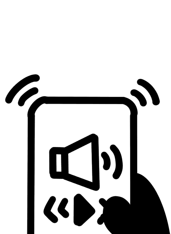
An museum app that provide turn-by-turn audio navigation and haptic feedback with clear directional prompts. It also delivers detailed audio descriptions of exhibits, enhanced with multi-sensory elements like ambient sounds to enrich the visitor experience.
Strengths
💪🏼
Enables visually impaired visitors to navigate without assistance.
💪🏼
Enhances engagement with audio descriptions and storytelling.
Weaknesses
👎🏼
May not work well on older smartphones.
👎🏼
Loud environments can make audio hard to hear.
Chosen Concept
After refining top 3 design concepts, I developed a criteria for success to test the design concepts again and select the strongest to pursue through the Harris Profile Decision Matrix. My final concept was the Accessible Museum App - Buddy, which combined key features from the other two ideas. (Why choose just one when you can pick the best of all? 😉)
📌
Here is how Buddy addresses the problem:
📳
Planning & Navigation
Showing available guided multi-sensory tours & providing turn-by-turn audio navigation with haptic feedback.
🛗
Physical Accessibility
Identifying accessible routes, elevators, and seating areas, with an option to request staff assistance when needed.
💬
Staff Training & Support
Enabling real-time communication between visitors and staff via chat or voice support.
Assistive Technology
Scannable QR codes that provide audio descriptions with historical context and storytelling, enhanced by immersive soundscapes like nature or classical music.
PROTOTYPING
Creating Buddy
Low-Fidelity
Below are some of my initial thoughts regarding our research and the application's goals. These low-fidelity designs gave me the first glimpse of how the app could work, with all the key functionalities implemented.
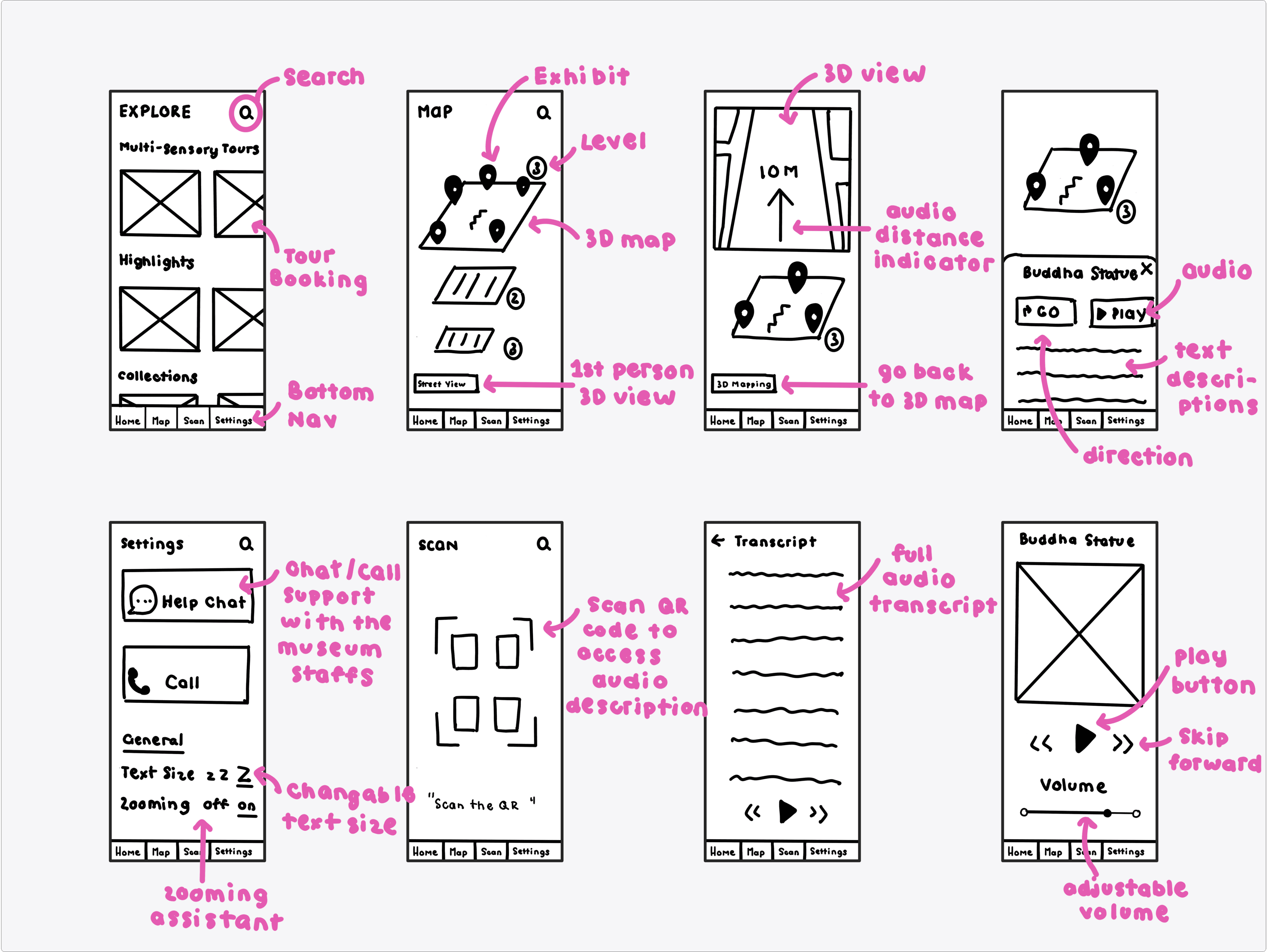
Mid-Fidelity
My “Sketch to Sense” phase—aka the Mid-fi stage—was dedicated to ensuring that the UX of the app aligns with the users' needs in terms of usability and functionality. Here are some of the wireframes and their interactions:
PROTOTYPING
First Iteration
Before going pixel-perfect, I conducted 6 usability tests & 6 expert tests on wireframes using various evaluation methods to gather feedback and validate key design decisions.
💬
Pre/Post-test Interviews
I conducted pre-test interviews to understand each user's context and expectations, and followed up with post-test discussions to clarify their thoughts.
👀
Observations
While users interacted with the prototype, I observed their behaviour and body language to identify signs of confusion, hesitation, or confidence during task completion.
🗣️
Think-aloud
I also encouraged users to verbalise their thoughts and decision-making processes as they navigated the app, helping me uncover hidden assumptions or usability challenges.
🧠
Cognitive Walkthrough
For expert evaluations, I used cognitive walkthroughs to assess how well the features integrated and how intuitively users could complete key tasks across the platform.
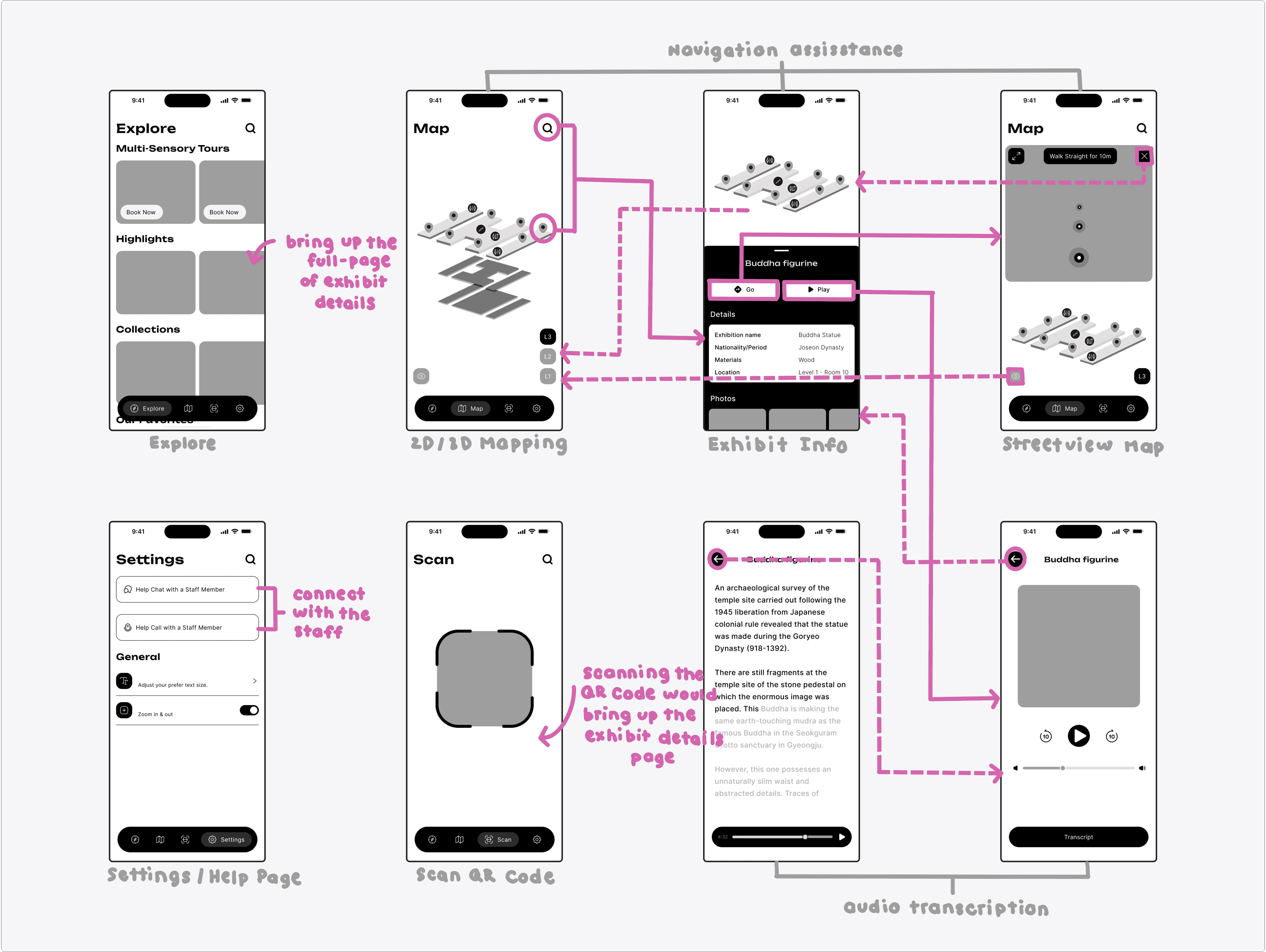
After gathering valuable insights from these evaluation methods, I began refining my mid-fi wireframes—making key adjustments and adding some fun colours 😁. Below, I’ve highlighted some of the most significant changes made to three user interaction pages.
EXPLORE PAGE
AUDIO PAGE
SCANNING PAGE
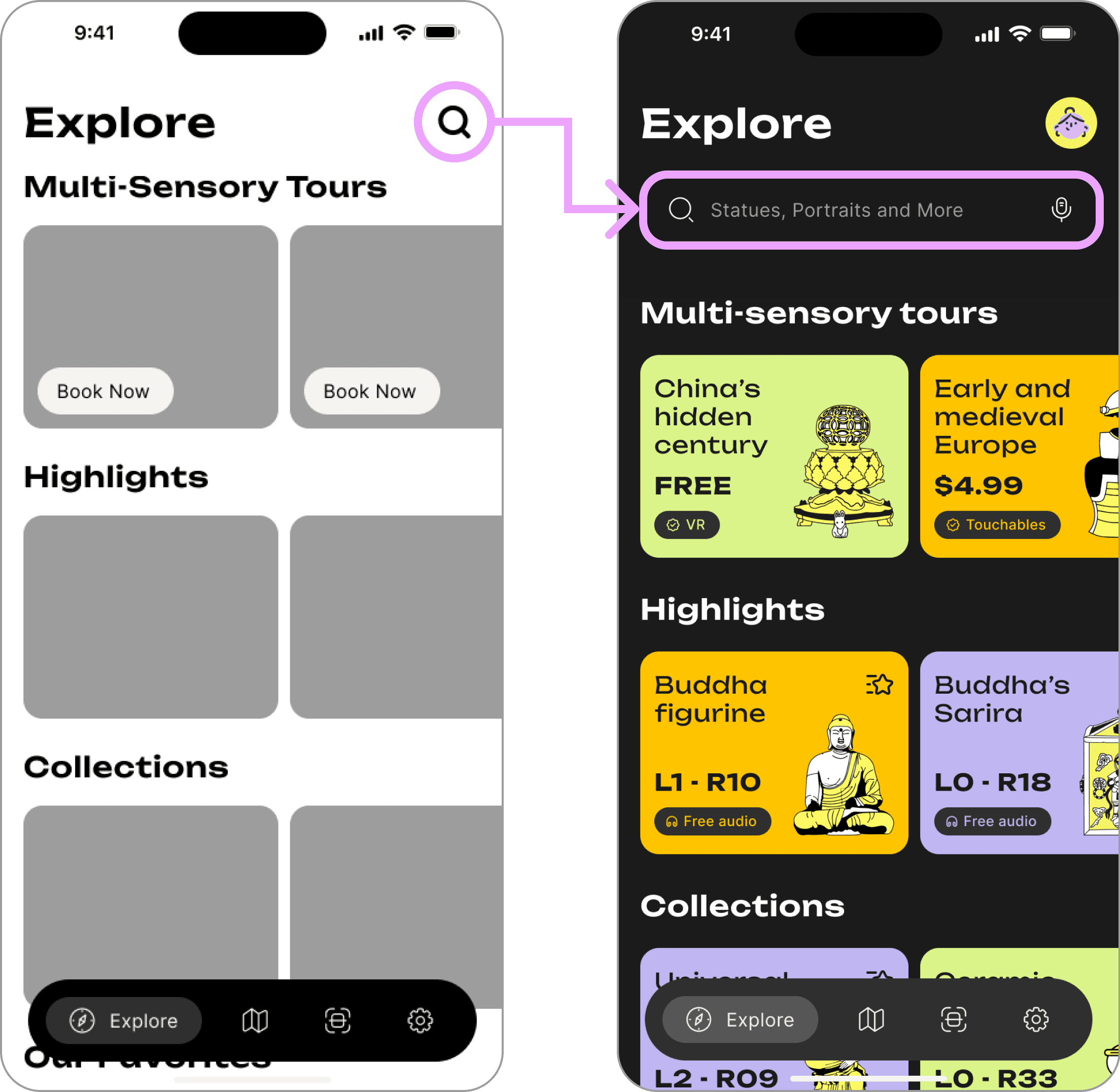
TESTING INSIGHT
Unclear Search Interaction
🚫
Users were unsure what to search for when only presented with a simple search icon.
🚫
Several users hesitated & overlooked the feature entirely.
🚫
‘What am I searching for exactly?’ - User 2 quoted.
IMPROVEMENTS
Increased Visibility & Usability
✅
Replaced the standalone search icon with a full search bar.
✅
Added placeholder text like “Search statues, portraits, events...” to guide user input.
✅
Helped users engage more with the app’s content.
PROTOTYPING
Second Iteration
After developing my first interactive prototype, I began user testing by conducting 6 expert-based heuristic evaluations using a structured spreadsheet template. Participants were also prompted to rate the severity of each usability issue, providing both qualitative and quantitative insights. These were then compiled into a usability-severity chart to highlight problem areas across different app screens.

The Settings Page received the highest number of usability problems and severity ratings, so it became my first stop for improvements. The Map Page had a few reported issues too, but nothing major—it just needs some light adjustments. Street View and Scan held up well, which indicated that those interactions were already on the right track.
SETTINGS PAGE
MAP PAGE
EXPLORE PAGE
AUDIO PAGE
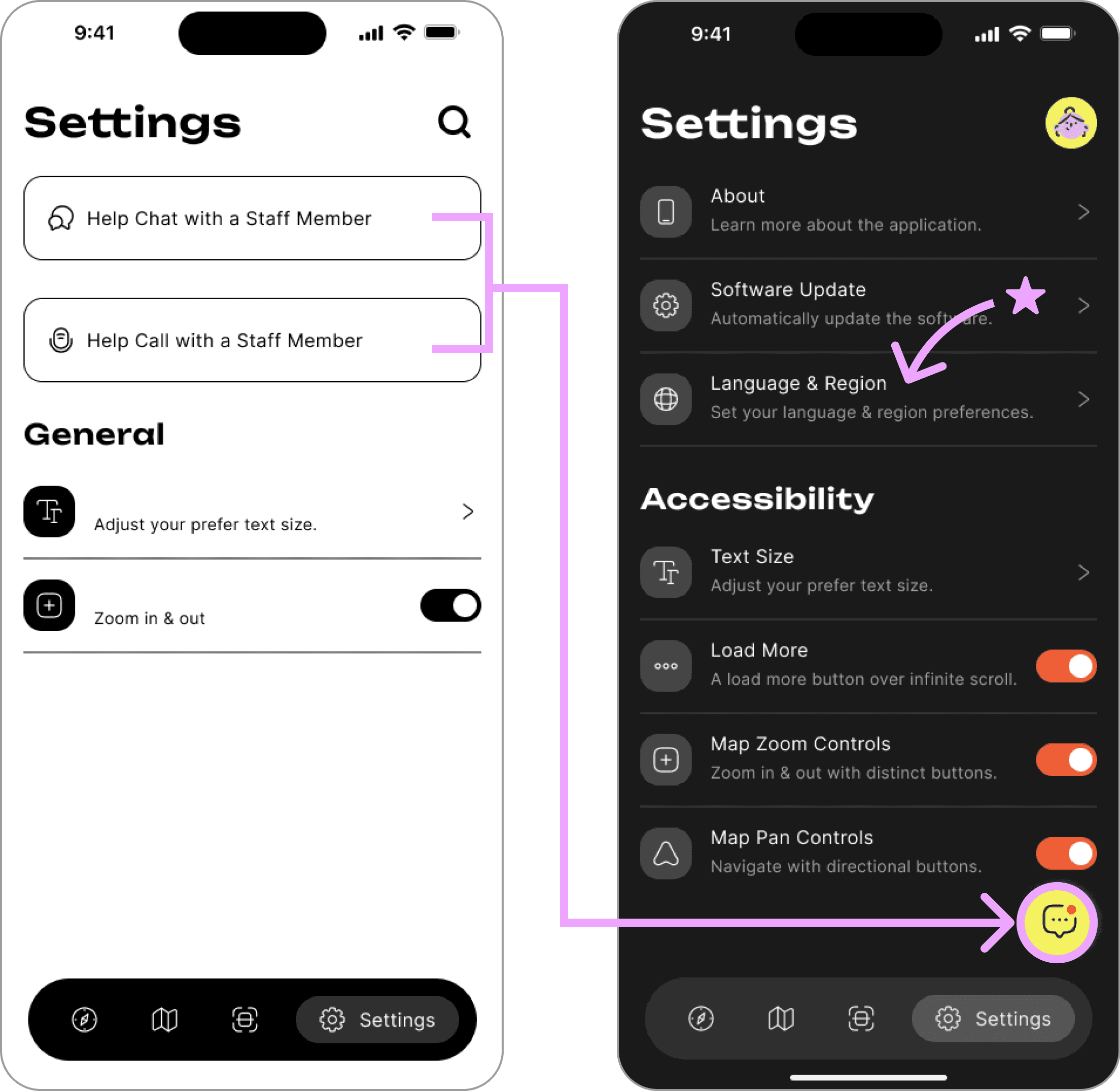
VIOLATED HEURISTIC PRINCIPLE
Visibility of System Status & User Control
🚨
Users questioned why the Help Chat and Call options were tucked away in the Settings Page, making support harder to access during active navigation.
🚨
Limited real-time assistance, especially when users needed help outside the settings context.
IMPROVEMENTS
Bringing Support Front & Center
✅
Added a floating chat button for instant staff support, improving accessibility during navigation.
✅
Added new toggles like Map Zoom and Pan Controls to assist users with fine motor or visual limitations.
✅
Added language setting to accommodate a broader population.
PROTOTYPING
Third Iteration
After applying feedback from Round 2, I conducted a final round of testing with 12 users using an unmoderated usability testing platform, Loop11. Through this platform, I asked participants to answer pre-test questions, complete 3 main tasks with their screen and audio enabled, and finish with a SUS survey to assess the overall usability.
88%
success
Task 1—Search for a multi-sensory tour experience (scented) by scrolling or using the filtering tabs. (use help chat if needed)
62%
success
Task 2—Find the direction to the Buddha Figurine via map searching and access its audio description. (use help chat if needed)
100%
success
Task 3—Use the back camera to scan the QR code or type in allocated number (2410) to access the audio description. (use help chat if needed)
SUCCESS
FAIL
ABANDON
The results from Loop11 highlight strong usability across most tasks, with Tasks 1 and 3 achieving high success rates. Task 2, however, stood out to me as an opportunity for improvement—with a 62% success rate and 18% abandonment—clearly emphasised challenges in map navigation and accessing audio content that I can now refine further.
MAP PAGE
OBSERVATION
They all got Stuck at ‘Filler’ Page
👉🏼
When users tapped ‘Directions’ they were taken to a ‘filler’ page with just the map and an orange pin.
👉🏼
Users had to tap the ‘orange pin’ twice to view the exhibit info page.
👉🏼
Reduced learnability as users may misinterpret the pause as a bug or loading delay.
SOLUTION
Just Remove It!
✅
The ‘filler’ page was removed to streamline the experience—redirecting users directly to the exhibit information page.
✅
Eliminating unnecessary clicks, improving both efficiency & learnability.
REFLECTION
What I’ve Learned So Far
Throughout my research and design journey for this project, I’ve learned some valuable lessons that have shaped not only my final outcome but also how I would approach similar projects in the future.
🧠
Challenge Assumptions when Designing for Accessibility
I initially conducted user research based on the pre-assumption that accessibility for visually impaired visitors mainly involved providing tools like audio guides or large print. However, as I went into user interviews and ethnographic research, I realised that accessibility is also about emotional comfort, independence, and engagement without constant assistance.
💁🏻♀️️
User Journey Map need more Research Inputs
During user interviews, I neglected to ask participants how they would solve the problem statement, which made creating a User Journey Map incredibly difficult. Next time, I would ask participants more solution-based questions, as the additional context they provided would help ensure my design addresses the pain points and gives me a more concrete foundation.
⚙️
Wireframes are Important,
and I Need More of them
I realised too late in the process that several unexplored alternatives to the solution that felt more engaging and better addressed some pain points. Having already conducted a usability test on a low-fi prototype for my initial solution at this stage, I was hesitant to start over. Next time, I would wireframe multiple approaches early on before committing to one.